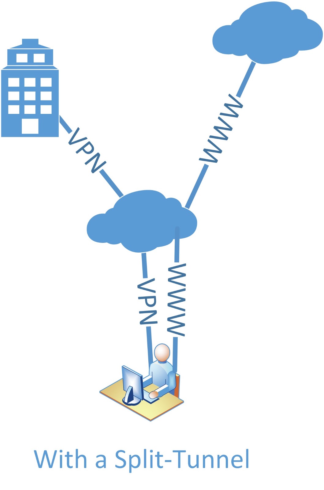
Why are all Split-Tunnel VPN diagrams so ugly?
Posted on Thu 21 May 2020 in Security
Right.
Today I needed to find a diagram of the traffic flow for a split-tunnel VPN. Nothing fancy, just a real simple user-facing diagram to form part of an article.
And friends, there was nothing. Nothing at all. I found proper technical ones from Cisco Meraki; fancy Office365 ones, depicting an ExpressRoute to O365 and tunnelling everything else through the VPN; and another Office365 tunnel with ExpressRoute and a split-tunnel for the rest of the traffic.
Pretty much the closest I came to my needs was this atrocity, via http://blog.soundtraining.net/2013/03/how-to-configure-split-tunneling-on.html:

So I went over to https://www.draw.io and whipped up something a bit prettier. This isn't marvelous, but it's way better than I could find anywhere else:

In retrospect, I could have done better - I really should have had the corporate tunnel going through the cloud of the internet. However this works for ne.
If you'd like to use this, feel free. You can even use this fancy URL to open the drawing as an editable vector graphic at Draw.io directly!